
Friday, March 8, 2013
Wednesday, March 6, 2013

The First things First Manifesto
means that as a graphic designer instead of making designs for businesses for
money we could, and should make designs as a way of expressing ourselves in a
different medium of art instead of the norm.
The Graphic Design field is growing everyday with new and better jobs
and there needs to be work but we should find ways to have fun in whatever we
do. We should find new ways to advertize products than that of the norm. We
should use our talents for more artistic ideas from street signs to buildings.
This is the only way that we can change our graphic design futures.
Personally as a Graphic Designer I have
a better knowledge of the Paint.Net program.
Also in the Adobe Photoshop Program I have learned some of the different
tools like the “Magic Wand” along with the “Quick Selection” tool. I have
learned how to make shadows in pictures with the “Dodge” and “Burn” Tools. I
have learned and quite successfully used the “Clone Stamp”. So over all my
Photoshop knowledge has greatly improved.
Due to my hard work, along with my great
improvement I feel that I deserve and A. I worked hard on all of my
assignments, and so the quality of the assignments improved with each project.
Even when the project didn’t turn out the way it was in my head (which was a lot
of the time) I still provided a quality piece of work. It was very helpful to
bounce ideas off of Maria and you in order to not only finish the piece but to
make it well. Even when my computer
turned my picture purple and deleted the tree all on its own, I was able to do something
else and then come back and finish.Tuesday, March 5, 2013

Thursday, February 21, 2013

Tuesday, February 12, 2013

Monday, February 11, 2013
Coke

This is my Magazine Advertisement. It is making you look at what Coke was in the past with the old coke bottle and all the new(ish) logos
Thursday, February 7, 2013
Magazine Cover
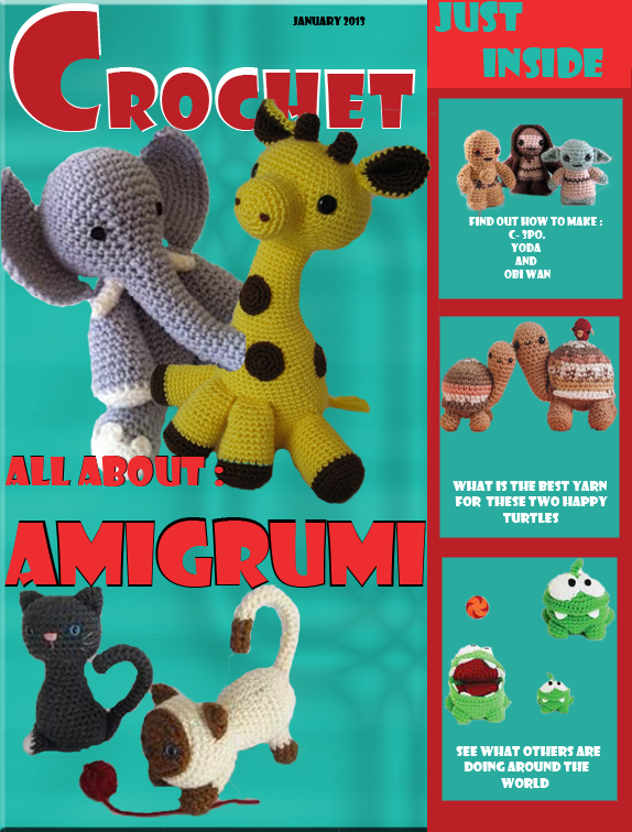
To make a magazine cover you need a template and for the template I chose to use People's magazine lay out. I made my topic out of Amigrumi which is crochet animals. I figured the colors felt craftsy.
Tuesday, January 29, 2013
Monday, January 28, 2013

Tuesday, January 22, 2013
Color
Hero
Paint Co.
Identity
Standards
 |
2013
Version
Introduction:
Graphic Designers have freedom to take an amount of
creativity to our websites and logos. We as a company respects that and only wish
to focus on a few guidelines so the company will have the identity that is as
unique as we are. We want to impact people with our customer service and
quality of our products.
Colors:
The Colors for our company is:
Iron Gray – R: 64 G: 64
B: 64 HEX: 404040
Radiant Red - R: 225 G: 0
B: 0 HEX: FF0000
Bright White - R: 225
G: 225 B: 225 HEX: FFFFFF
Burgundy - R: 127
G: 0 B: 0 HEX: 7F0000
Typography:
For Fonts we will use: Elephant, Cataneo
BT, and Castellar.
Logos
/Signatures:
Our logo will consist of the white background swirled with red
and burgundy, with the grey signature letters swirled with the white.
Appropriate
Use of Logo: Borders around the logos
 |
|||
 |
|||
or
Inappropriate
Use of Logo:
Changing coloring or brightness
 |
 |
or
Promotional
Material:

Envelopes


Business Cards
Stationary
Web
Design/ Content:
As a company we need to reach as many people as possible so
we will have a facebook page and also a webpage. On our facebook page we will use the default
settings except for our pictures and for that we will use our guidelines for
our logo.
Conclusion:
As Color Hero is proud of our customer service and product
we also understand the need for creativity and a company identity.
Subscribe to:
Posts (Atom)